CLIENT
MOON
HOTEL AND RESTAURANT
ABOUT
ALPINE BOUTIQUE HIDEAWAY FOR ADULTS. A WORLD AWAY.
SERVICES
ART DIRECTION, LOGO DESIGN, PRINT, VISUAL LANGUAGE, DIGITAL, WAYFINDING


STRATEGY The market for luxury alpine hotels is shaped by similar promises of nature, wellness and relaxation. Moon is positioned not through its amenities or location, but through an emotional need. The brand is designed for adults seeking distance from their everyday world and who see tranquillity as a new form of luxury. Inspired by the moon as a symbol of distance and stillness, Moon places calm and retreat at the heart of the guest experience. Der Markt für alpine Luxushotels ist geprägt von ähnlichen Versprechen: Natur, Wellness und Erholung. Die Positionierung von Moon definiert sich nicht über Ausstattung oder Lage, sondern über ein emotionales Bedürfnis. Die Marke richtet sich an Erwachsene, die Abstand von ihrer gewohnten Welt suchen und Ruhe als neuen Luxus verstehen. Inspiriert vom Mond als Symbol für Distanz und Stille entstand eine Marke, die Ruhe und Rückzug in den Mittelpunkt stellt.

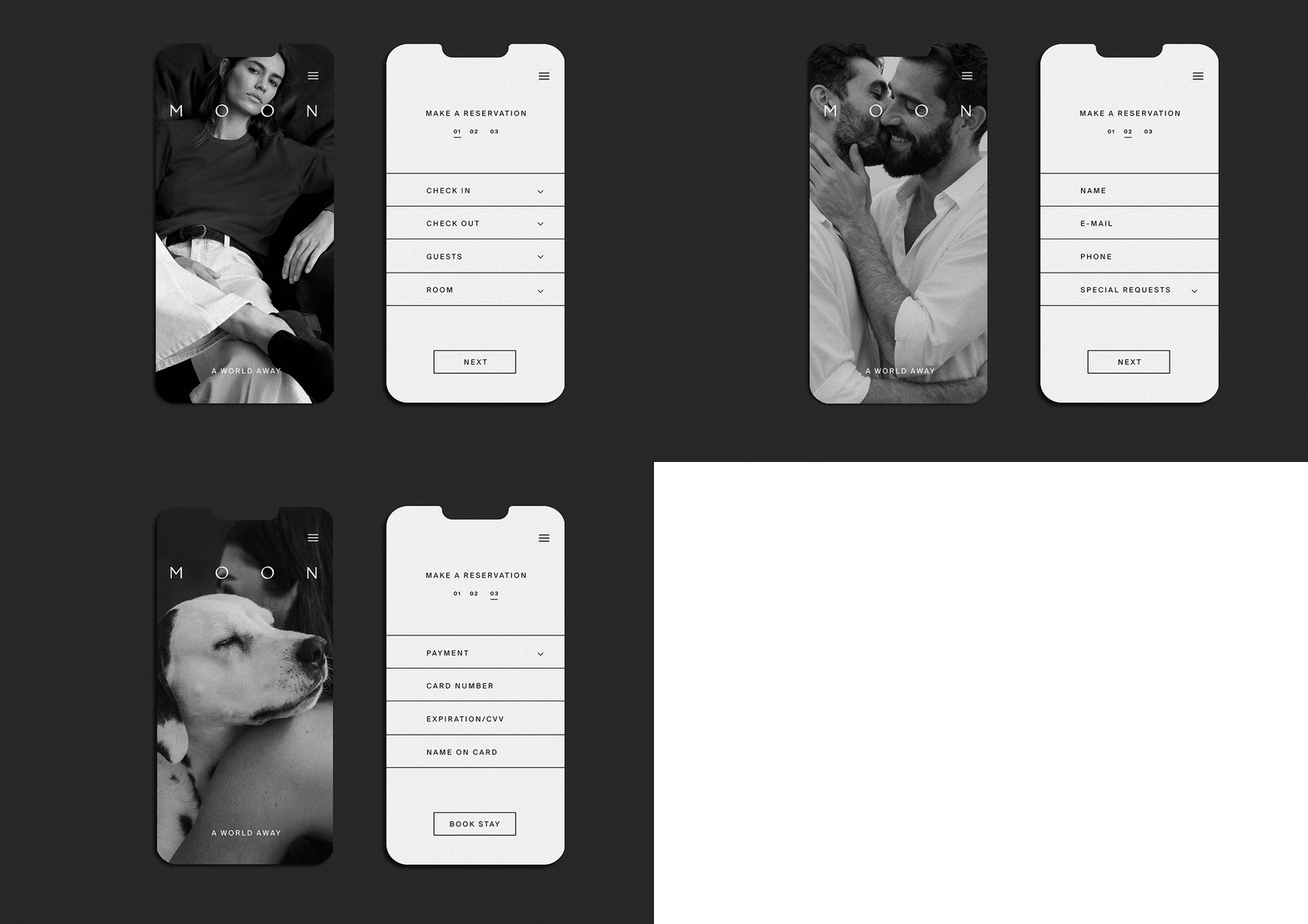

DESIGN The black/white colour palette of Moon is inspired by the phases of the moon. It feels calm and timeless, reinforcing the hotel’s character as a place of retreat and relaxation. The emotional black/white visual language brings the brand promise to life, conveying a sense of calm, relaxation and distance from everyday life. The “O” acts as an abstracted full moon and serves as a recurring design element throughout the identity. Die Schwarz/Weiß Farbwelt von Moon ist von den Phasen des Mondes inspiriert. Sie wirkt ruhig und zeitlos und unterstreicht den Charakter des Hotels als Ort der Entschleunigung. Die emotionale Bildsprache in Schwarz/Weiß macht den Anspruch der Marke erlebbar und vermittelt Ruhe, Erholung und Distanz zum Alltag. Das „O“ bildet als abstrahierter Vollmond ein wiederkehrendes Gestaltungselement.

